In the briefest of terms: SAP Fiori is available for clients on desktop computers right up to mobile devices such as tablets and smartphones. In all, Fiori is a design concept for user interfaces. Here, SAP Fiori represents much more than just a concept: It brings with it design guidelines, tools and libraries (recently: SAPUI5). The aim: To provide developers with the options of developing a Fiori frontend which behaves just like an app, if required. For younger users, SAP Fiori applications provide the longed-for ease of use over various devices.
Brief Fiori history
Fiori is also often viewed distinctly from SAP GUI, which was developed many years before. Its first publication was in the early 90s. Now, SAP GUI is available in version 7.60 (02/2020). However, SAP Fiori itself has already been around for a while. The first Fiori release was in 2013, version 3 is currently on its way.
It’s therefore not surprising that SAP GUI and Fiori are worlds apart. This difference is made clear by the following two images:
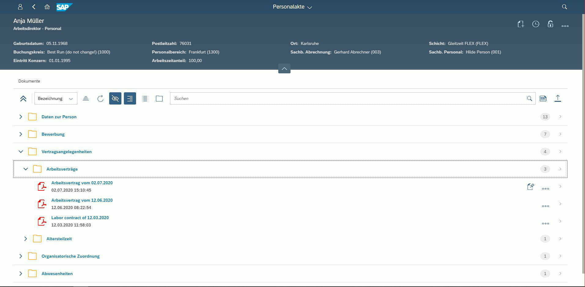
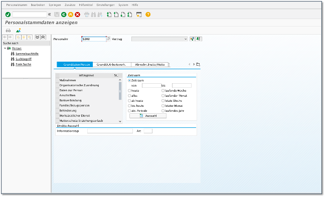
From the pictures, it immediately becomes clear that SAP with Fiori has undergone a paradigm shift. The thing that represents an ideal for experienced users and those familiar with the functions in the form of SAP GUI, if not an attractive tool, is often a barrier for beginners. Too many and, above all, frequently hidden, functions make it difficult to get started.
With SAP Fiori on the other hand, SAP has taken user friendliness and flexibility into account. Fiori applications have an identical range of functions. However, the Fiori user interface shows a set of functions and features which are aligned with the role of the user. Each user only sees what they require for their day-to-day work. Just as today’s younger users desire, for example, easily accessible, tidy and can be used on almost any device. Some may mistrustfully suspect the “Consumerization of IT” behind Fiori – and yes, this is backed by an idea.
SAP Fiori Design Guidelines
Just like other large software platforms, SAP has also formulated the Fiori Design Guidelines along with the introduction of Fiori. The intention: To provide software developers and UI designers with guidelines which can be used to design and develop Fiori applications and apps. Fiori applications should be recognizable and coherent to the user, consistent and predictable in how they behave. Or as SAP describe it themselves:
These guidelines standardize the services used in many Fiori apps. Whether this is the Fiori Launchpad, first to appear on almost every application, or the Global Search function which is typical for Fiori, etc. The guidelines also determine the overarching features. Control elements such as buttons or functional areas, user interface elements such as tiles or toolbars etc.
For every application – the Fiori Launchpad
No matter which applications the Fiori system hosts, the login leads the user directly and always to the SAP Fiori Launchpad homepage.
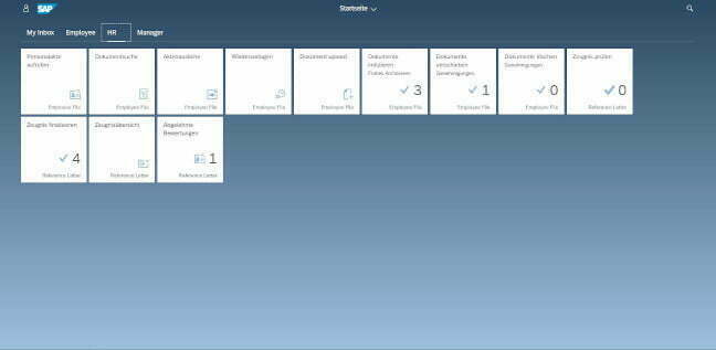
Central UI elements: Fiori Tiles
The Fiori tiles are among the central user interface elements, just like the Launchpad. They form the entry point for any SAP application: These include smart business, analysis and transaction apps, such as for incoming invoices in SAP, contract management with SAP or, with the technology described here, also as a contract app.
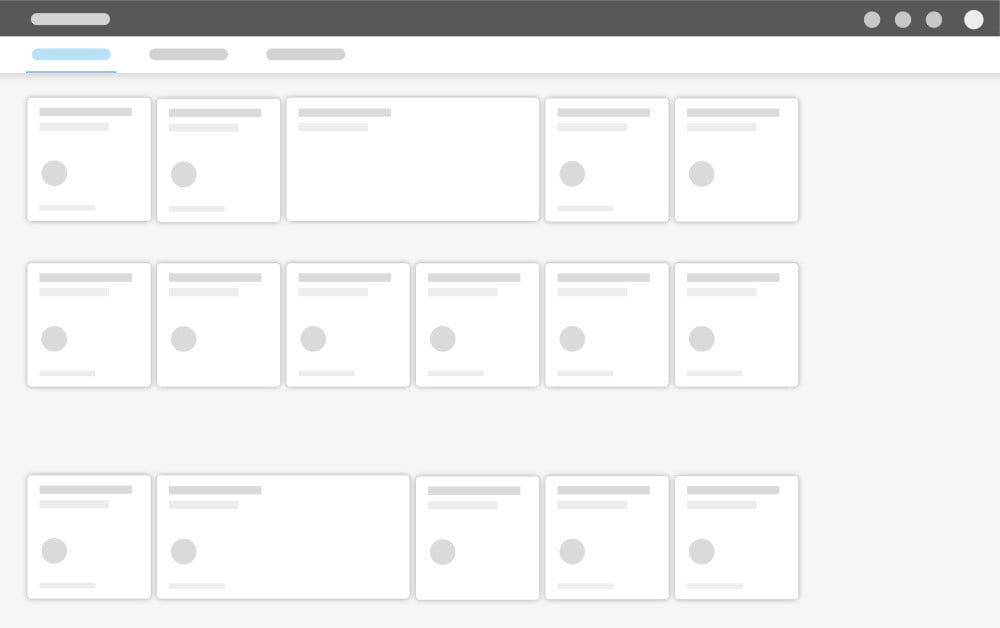
But within the tiles themselves, you will find firmly defined areas. Data from the relevant applications is mapped in these areas.

Global Search – the launchpad has what it takes
SAP Fiori Launchpad offers a global search function that searches across all apps and business objects
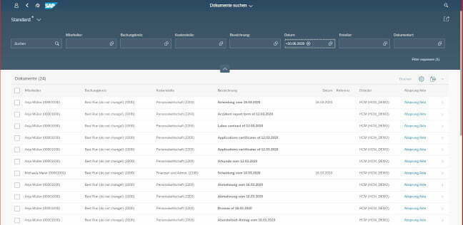
The SAP Fiori guidelines therefore provide a proper catalog for designing Fiori applications – from the Launchpad to the Fiori Shell. There are just a few questions to clarify which tools are used to implement this.
SAPUI5 – for apps and applications:
SAP User Interface for HTML5
After the Fiori Design Guidelines describe how UI elements should look, SAP have also made available a toolkit – a development framework – for creating Fiori applications. It’s called “SAP User Interface for HTML5”, for short: SAPUI5. Since 2013, the UI framework has defined the 250 user interface elements. JSON (JavaScript Object Notation), XML (Extensible Markup Language) and OData (Open Data Protocol) are clearly intended as data exchange formats.
Central elements of this framework are based on JQUERY (JavaScript), HTML5 and CSS3. SAP is clearly focusing on web standards. While SAPUI5 represents a library which is proprietary and subject to license, OpenUI5 also exists – this is the Opensource version of the UI5 framework under the Apache License 2.0.
As the components used in SAPUI5 were already widespread before its introduction, the SAP framework is also excellently suited to development. The technologies for creating apps and applications are relatively easy to master. UI5 also focuses on a model which separates the data logic and the UI (Model View Controller, for short: MVC model), which greatly simplifies development.
SAPUI5 can therefore be used for the development of responsive, mobile SAP business applications. Usability is the focus, and a standardized look and feel is boosted by the SAP Fiori guidelines and UI5. Moreover, UI5 is available via the SAP Netweaver Gateway for all SAP products from the SAP BUSINESS SUITE, via the SAP ERP system and its successor S/4HANA, right up to SAP Business Information Warehouse.
For apps and applications from the Cloud:
the SAP Fiori Cloud
Of course, you don’t just use the Fiori User Experience on-premises, but also in the Cloud or in hybrid scenarios. In this way, SAP Fiori Cloud represents a service which provides and supplies the described Fiori elements for operation in a defined and preconfigured manner. SAP is therefore trying to drive forward uniformity with regard to the Fiori look and feel via the Cloud – mobile apps in particular and other applications benefit from this.
Outlook: Future of SAP Fiori
There are seven years between the first and last version of SAP Fiori in Version 3.0 (September 2019). Besides many minor changes, there are three major innovations. With Fiori 3.0, cards were introduced as a user interface element for the first time; these replace the familiar tiles. At the same time, SAP now offers a new standard theme: Quartz Light. This complements the Belize Theme of the previous Fiori 2 version. In addition, SAP is replacing the Fiori interface with a shell bar – a new horizontal menu bar with new interaction and navigation elements.
Despite all changes in recent years, SAP remains true to the core principles of the Design Guidelines. SAP software should be as coherent as it is light and easy to use – through a role-based and responsive user interface. To transfer this idea via SAP Fiori 3.0 to the SAP product portfolio, e.g. to SuccessFactors, Fieldglass, SAP Ariba etc., is one of the main goals for the coming years.